eda_report.plotting
You can find a wealth of plotting libraries at the PyViz website.
The plotting functions below are implemented using matplotlib. In the interest of efficiency, especially for large datasets with numerous columns; these plotting functions use a non-interactive matplotlib backend. This was inspired by Embedding in a web application server, which says in part:
You can conveniently view the generated figures in a jupyter notebook using %matplotlib inline, as shown in this demo notebook.
Otherwise, you’ll probably need to export them as images.
Plotting Examples
>>> import eda_report.plotting as ep
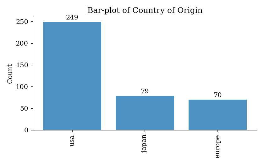
>>> ax = ep.bar_plot(mpg_data["origin"], label="Country of Origin")
>>> ax.figure.savefig("bar-plot.png")
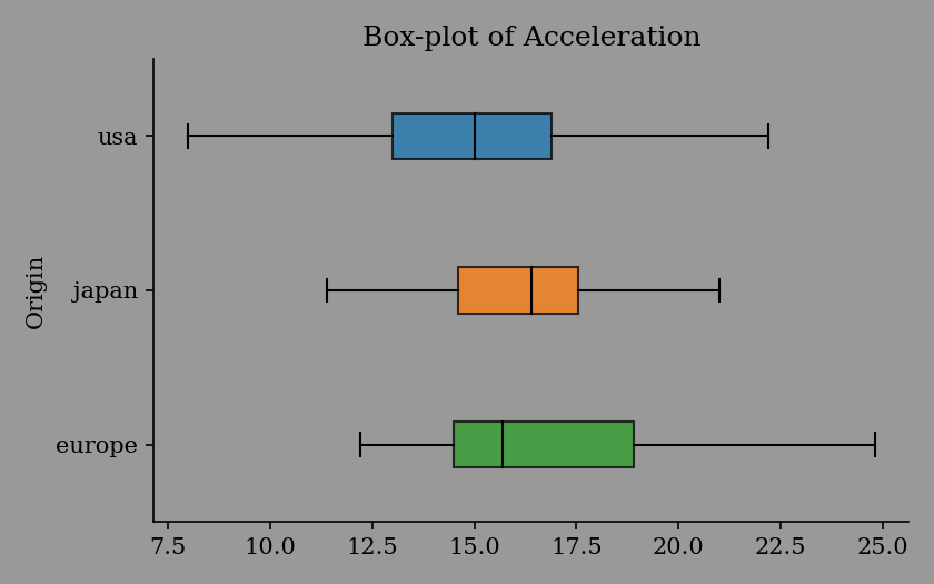
>>> ax = ep.box_plot(mpg_data["acceleration"], label="Acceleration", hue=mpg_data["origin"])
>>> ax.figure.savefig("box-plot.png")

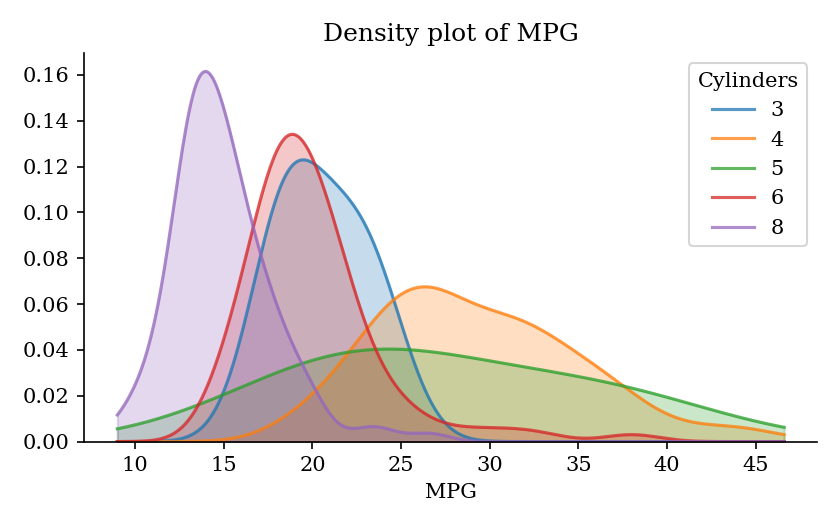
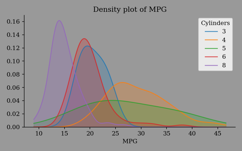
>>> ax = ep.kde_plot(mpg_data["mpg"], label="MPG", hue=mpg_data["cylinders"])
>>> ax.figure.savefig("kde-plot.png")
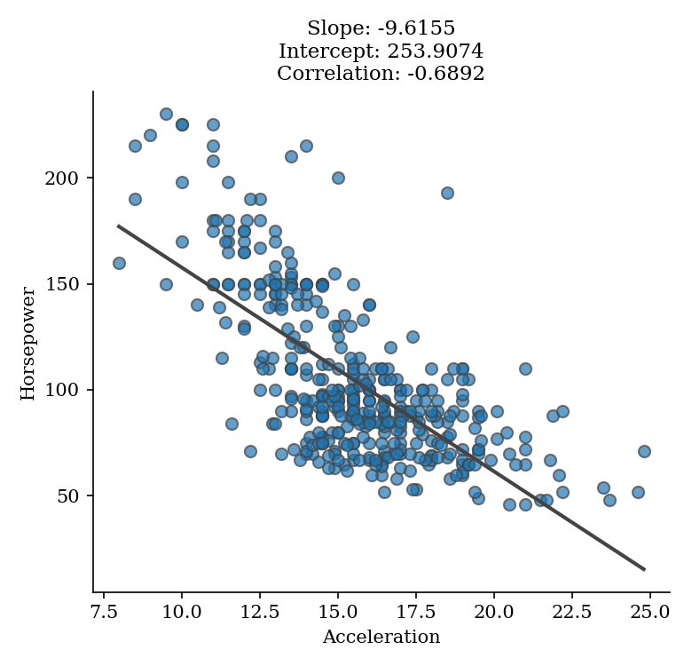
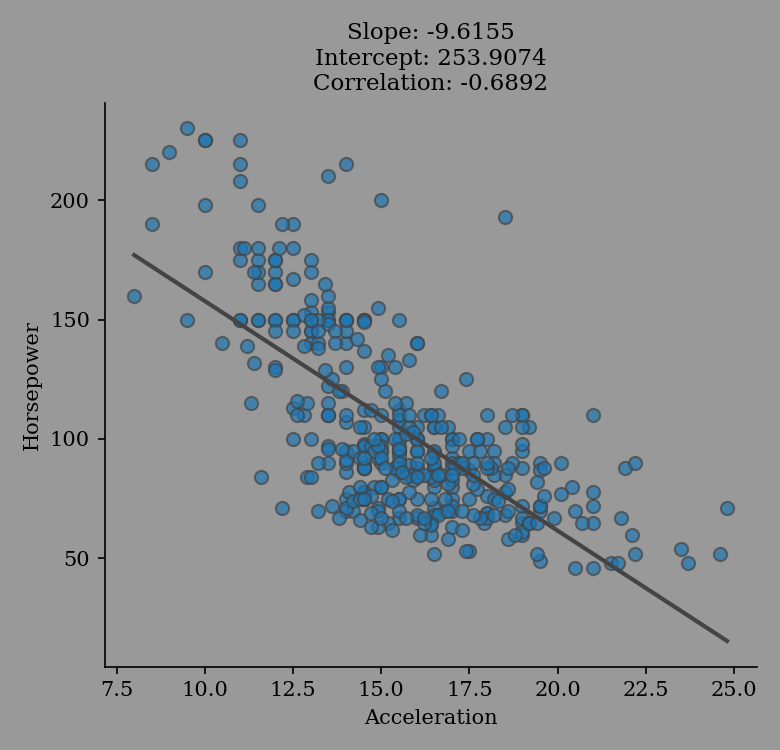
>>> ax = ep.regression_plot(mpg_data["acceleration"], mpg_data["horsepower"],
...                         labels=("Acceleration", "Horsepower"))
>>> ax.figure.savefig("regression-plot.png")
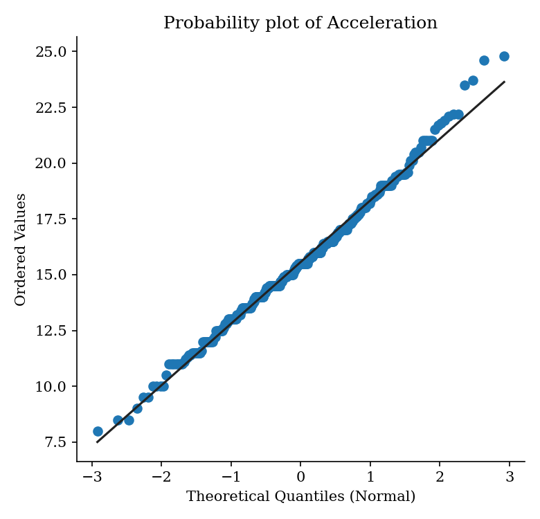
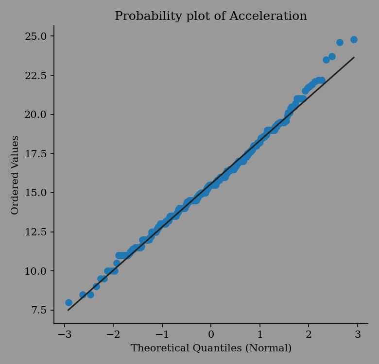
>>> ax = ep.prob_plot(mpg_data["acceleration"], label="Acceleration")
>>> ax.figure.savefig("probability-plot.png")
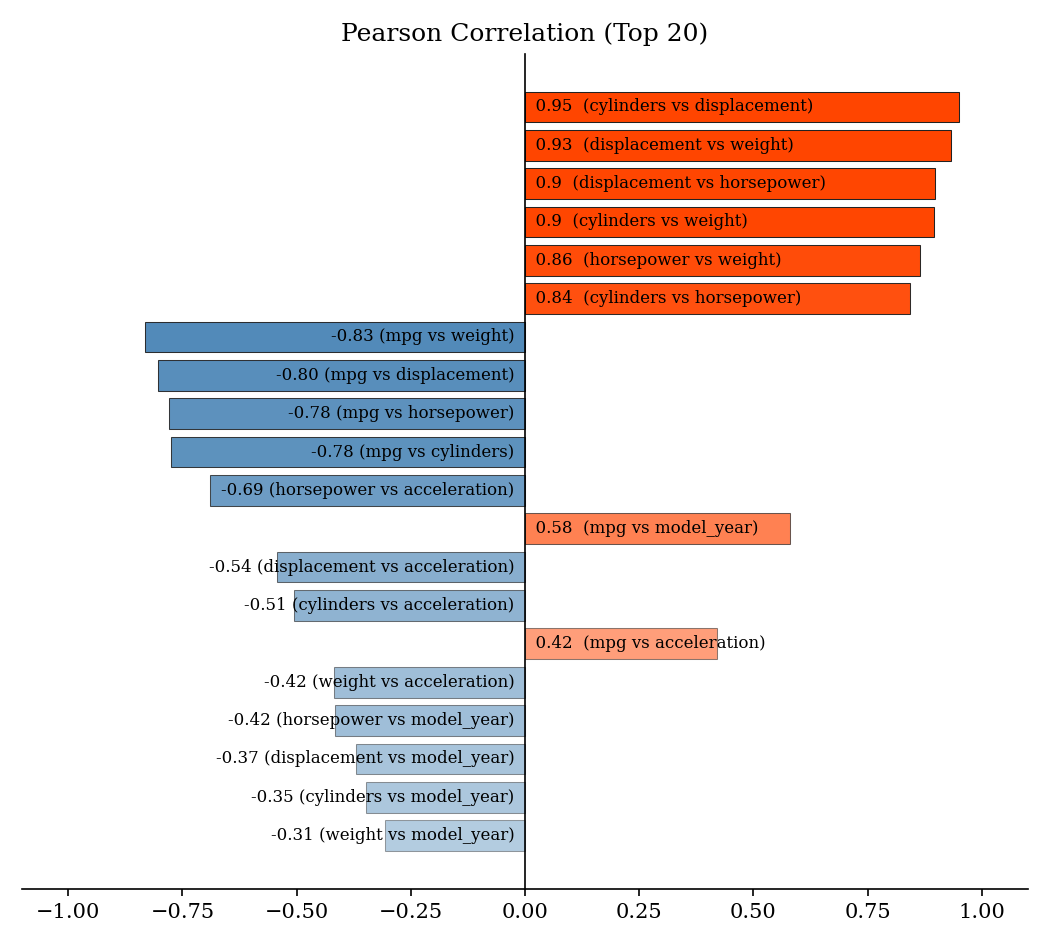
>>> ax = ep.plot_correlation(mpg_data)
>>> ax.figure.savefig("correlation-plot.png")

- eda_report.plotting.bar_plot(data: Iterable, *, label: str, color: str | Sequence = None, ax: Axes = None) Axes[source]
Get a bar-plot from a sequence of values.
- Parameters:
data (Iterable) – Values to plot.
label (str) – A name for the
data, shown in the title.color (Union[str, Sequence]) – A valid matplotlib color specifier.
ax (matplotlib.axes.Axes, optional) – Axes instance. Defaults to None.
- Returns:
Matplotlib axes with the bar-plot.
- Return type:
- eda_report.plotting.box_plot(data: Iterable, *, label: str, hue: Iterable = None, color: str | Sequence = None, ax: Axes = None) Axes[source]
Get a box-plot from numeric values.
- Parameters:
data (Iterable) – Values to plot.
label (str) – A name for the
data, shown in the title.hue (Iterable, optional) – Values for grouping the
data. Defaults to None.color (Union[str, Sequence]) – A valid matplotlib color specifier.
ax (matplotlib.axes.Axes, optional) – Axes instance. Defaults to None.
- Returns:
Matplotlib axes with the box-plot.
- Return type:
- eda_report.plotting.kde_plot(data: Iterable, *, label: str, hue: Iterable = None, color: str | Sequence = None, ax: Axes = None) Axes[source]
Get a kde-plot from numeric values.
- Parameters:
data (Iterable) – Values to plot.
label (str) – A name for the
data, shown in the title.hue (Iterable, optional) – Values for grouping the
data. Defaults to None.color (Union[str, Sequence]) – A valid matplotlib color specifier.
ax (matplotlib.axes.Axes, optional) – Axes instance. Defaults to None.
- Returns:
Matplotlib axes with the kde-plot.
- Return type:
- eda_report.plotting.plot_correlation(variables: Iterable, max_pairs: int = 20, color_pos: str | Sequence = 'orangered', color_neg: str | Sequence = 'steelblue', ax: Axes = None) Axes[source]
Create a bar chart showing the top
max_pairsmost correlated variables. Bars are annotated with variable pairs and their respective Pearson correlation coefficients.- Parameters:
variables (Iterable) – 2-dimensional numeric data.
max_pairs (int) – The maximum number of numeric pairs to include in the plot. Defaults to 20.
color_pos (Union[str, Sequence]) – Color for positive correlation bars. Defaults to “orangered”.
color_neg (Union[str, Sequence]) – Color for negative correlation bars. Defaults to “steelblue”.
ax (matplotlib.axes.Axes, optional) – Axes instance. Defaults to None.
- Returns:
A bar-plot of correlation data.
- Return type:
- eda_report.plotting.prob_plot(data: Iterable, *, label: str, marker_color: str | Sequence = 'C0', line_color: str | Sequence = '#222', ax: Axes = None) Axes[source]
Get a probability-plot from numeric values.
- Parameters:
data (Iterable) – Values to plot.
label (str) – A name for the
data, shown in the title.marker_color (Union[str, Sequence]) – Color for the plotted points. Defaults to “C0”.
line_color (Union[str, Sequence]) – Color for the line of best fit. Defaults to “#222”.
ax (matplotlib.axes.Axes, optional) – Axes instance. Defaults to None.
- Returns:
Matplotlib axes with the probability-plot.
- Return type:
- eda_report.plotting.regression_plot(x: Iterable, y: Iterable, labels: Tuple[str, str], marker_color: str | Sequence = 'C0', line_color: str | Sequence = '#444', ax: Axes = None) Axes[source]
Get a regression-plot from the provided pair of numeric values.
- Parameters:
x (Iterable) – Numeric values.
y (Iterable) – Numeric values.
labels (Tuple[str, str]) – Names for x and y respectively, shown in axis labels.
marker_color (Union[str, Sequence]) – Color for the plotted points. Defaults to “C0”.
line_color (Union[str, Sequence]) – Color for the line of best fit. Defaults to “#444”.
ax (matplotlib.axes.Axes, optional) – Axes instance. Defaults to None.
- Returns:
Matplotlib axes with the regression-plot.
- Return type: