Quickstart
Using the Graphical User Interface
The command eda-report launches a graphical window to help select a csv or excel file to analyze:
$ eda-report

A tkinter-based graphical user interface to the application
You will be prompted to enter your desired title, groupby/target variable, graph color & output file-name. Afterwards, a report is generated, as specified, from the contents of the selected file.
Hint
For help with Tk - related issues, consider visiting TkDocs.
Using the Command Line Interface
You can specify an input file and an output file-name:
$ eda-report -i data.csv -o some_name.docx
$ eda-report -h
usage: eda-report [-h] [-i INFILE] [-o OUTFILE] [-t TITLE] [-c COLOR]
                  [-g GROUPBY]

Automatically analyze data and generate reports. A graphical user interface
will be launched if none of the optional arguments is specified.

optional arguments:
  -h, --help            show this help message and exit
  -i INFILE, --infile INFILE
                        A .csv or .xlsx file to analyze.
  -o OUTFILE, --outfile OUTFILE
                        The output name for analysis results (default: eda-
                        report.docx)
  -t TITLE, --title TITLE
                        The top level heading for the report (default:
                        Exploratory Data Analysis Report)
  -c COLOR, --color COLOR
                        The color to apply to graphs (default: cyan)
  -g GROUPBY, -T GROUPBY, --groupby GROUPBY, --target GROUPBY
                        The variable to use for grouping plotted values. An
                        integer value is treated as a column index, whereas a
                        string is treated as a column label.
From an Interactive Session
You can use the get_word_report() function to generate reports:
>>> import eda_report
>>> eda_report.get_word_report(iris_data)
Analyze variables:  100%|███████████████████████████████████| 5/5
Plot variables:     100%|███████████████████████████████████| 5/5
Bivariate analysis: 100%|███████████████████████████████████| 6/6 pairs.
[INFO 16:14:53.648] Done. Results saved as 'eda-report.docx'
<eda_report.document.ReportDocument object at 0x7f196753bd60>
You can use the summarize() function to analyze datasets:
>>> eda_report.summarize(range(50))

Name: var_1
Type: numeric
Non-null Observations: 50
Unique Values: 50 -> [0, 1, 2, 3, 4, 5, 6, 7, 8, 9, 10, 11, 12, 13, [...]
Missing Values: None

                  Summary Statistics
                  ------------------
        Average:                      24.5000
        Standard Deviation:           14.5774
        Minimum:                       0.0000
        Lower Quartile:               12.2500
        Median:                       24.5000
        Upper Quartile:               36.7500
        Maximum:                      49.0000
        Skewness:                      0.0000
        Kurtosis:                     -1.2000

                  Tests for Normality
                  -------------------
                               p-value Conclusion at α = 0.05
D'Agostino's K-squared test  0.0015981  Unlikely to be normal
Kolmogorov-Smirnov test      0.0000000  Unlikely to be normal
Shapiro-Wilk test            0.0580895        Possibly normal
>>> eda_report.summarize(iris_data)

                  Summary Statistics for Numeric features (4)
                  -------------------------------------------
                count     avg  stddev  min  25%   50%  75%  max  skewness  kurtosis
  sepal_length    150  5.8433  0.8281  4.3  5.1  5.80  6.4  7.9    0.3149   -0.5521
  sepal_width     150  3.0573  0.4359  2.0  2.8  3.00  3.3  4.4    0.3190    0.2282
  petal_length    150  3.7580  1.7653  1.0  1.6  4.35  5.1  6.9   -0.2749   -1.4021
  petal_width     150  1.1993  0.7622  0.1  0.3  1.30  1.8  2.5   -0.1030   -1.3406

                Summary Statistics for Categorical features (1)
                -----------------------------------------------
                    count unique     top freq relative freq
            species   150      3  setosa   50        33.33%


                        Pearson's Correlation (Top 20)
                        ------------------------------
      petal_length & petal_width -> very strong positive correlation (0.96)
     sepal_length & petal_length -> very strong positive correlation (0.87)
      sepal_length & petal_width -> very strong positive correlation (0.82)
      sepal_width & petal_length -> moderate negative correlation (-0.43)
       sepal_width & petal_width -> weak negative correlation (-0.37)
      sepal_length & sepal_width -> very weak negative correlation (-0.12)
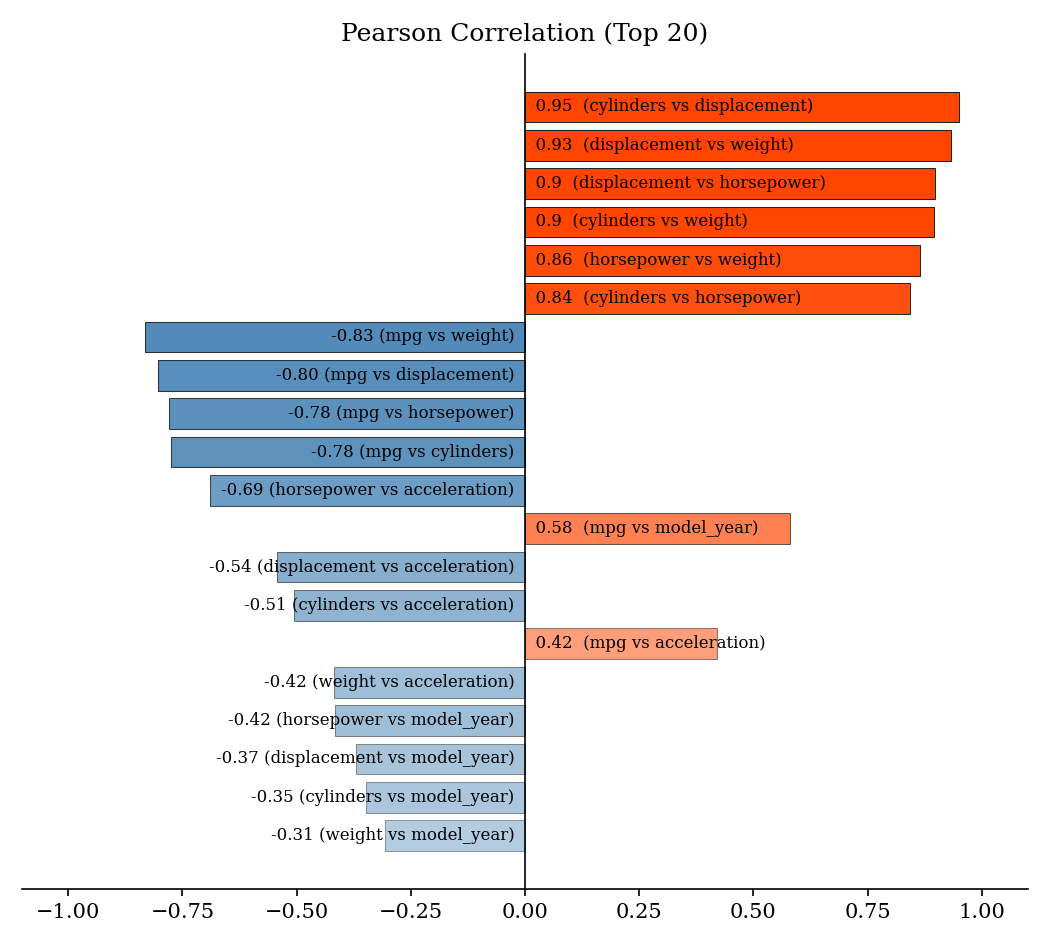
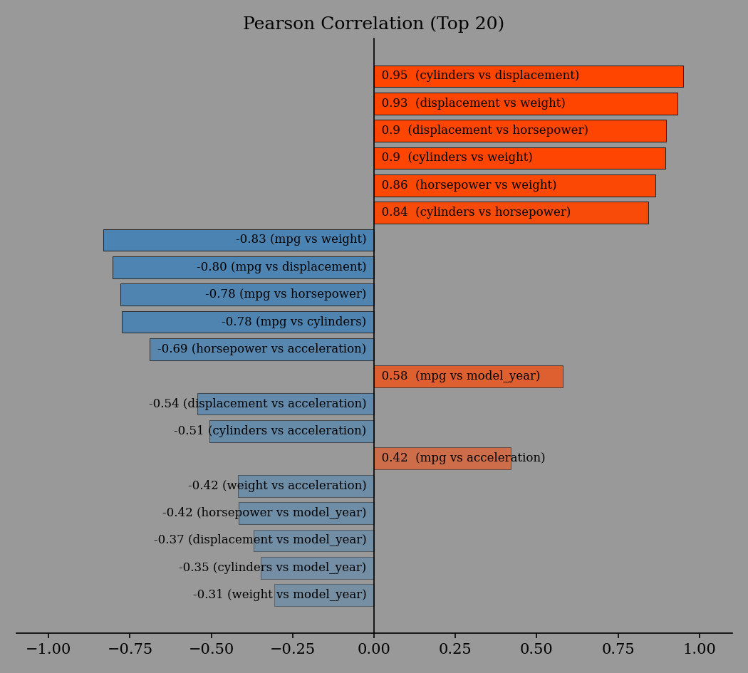
You can plot several statistical graphs (see Plotting Examples):
>>> import eda_report.plotting as ep
>>> ax = ep.plot_correlation(mpg_data)
>>> ax.figure.savefig("correlation-plot.png")